


About KAIT
- About KAIT
- KAIT Introduction
- CI
- KAIT CI
The spirit of Korea Association for ICT Promotion is expressed by making the KAIT logo stand out as a basis and symbolically displaying the light and speed of information and communication above and below it. Corporate Color is based on Light Green and Deep Blue, Light Green symbolizing a clear and bright future, and Deep Blue meaning facilitating organization forming for IT companies around.


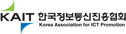
- LOGO
- Color System
- Main Color
-
KAIT Green C50 + Y100
-
KAIT Blue C100 + Y50
-
KAIT Black B100
-
KAIT Gray
-
- Sub Color
-
KAIT Black B100
-
KAIT Gold C5 + M25 + Y95 + B25
-
KAIT Green C50 + Y100
-
KAIT Silver
-
- Main Color
- Horizontal combination
-
- Pattern System